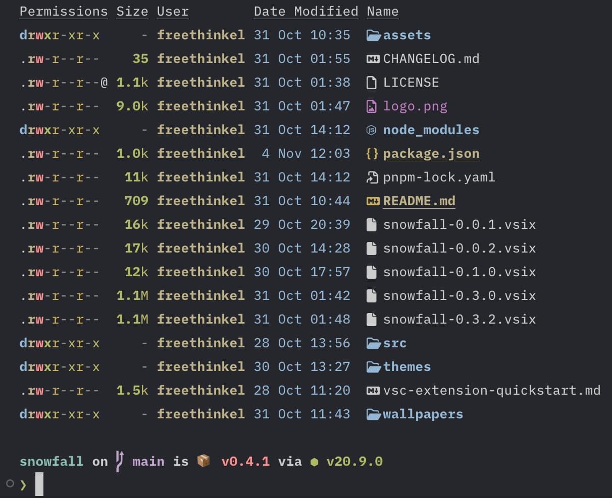
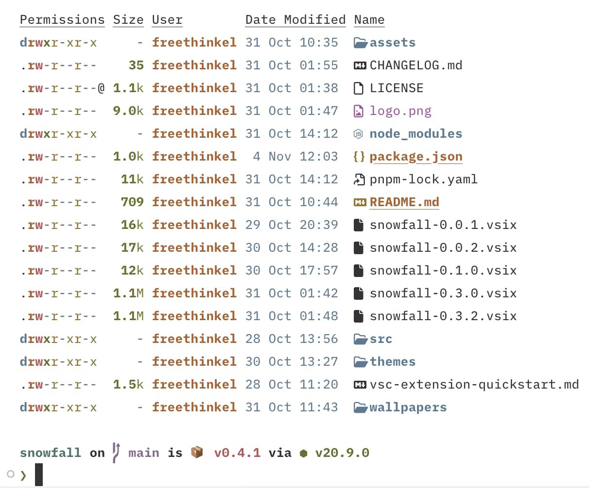
How I Used OKLCH to Improve My VS Code Theme
As a programmer, I often find myself switching code editor themes regularly. It’s something I enjoy doing—it helps keep my workspace fresh and inspiring. In the past, I’ve created one VS Code theme and a couple of themes for Neovim, but I wanted to take things further. This time, I decided to create my own VS Code theme builder using TypeScript. This approach not only made the process easier for me but also allowed me to experiment with advanced color models like OKLCH.
Why Build a Theme Builder?
You might wonder: why not just use a standard JSON schema for creating themes? The main reason is convenience. When you rely on a JSON schema, repeated colors become a hassle. For example, if I use #ffccbb as my accent color, I have to copy and paste it everywhere it’s needed. If I later decide to tweak that color, I need to manually replace it in multiple places (yes, search-and-replace helps, but it’s not ideal).
This repetitive process led me to develop a theme builder. With it, I can avoid hardcoding colors and instead rely on reusable tokens. More importantly, the builder allows me to dynamically generate variations of a color, such as lighter or darker shades, all based on the same palette. Here’s an example of the theme structure I’m using:
export type Theme = {
  name: string;
  type: "dark" | "light";
  accent: string;
  background: string;
  foreground: string;
  tokens: {
    brackets: string[];
    comment: string;
    strings: string;
    types: string;
    functions: string;
    properties: string;
    keywords: string;
    constants: string;
    operators: string;
  };
  diagnostic: {
    error: string;
    warning: string;
    info: string;
  };
  git: {
    added: string;
    modified: string;
    removed: string;
  };
  terminal?: {
    black: string;
    red: string;
    green: string;
    yellow: string;
    blue: string;
    magenta: string;
    cyan: string;
    white: string;
    brightBlack: string;
    brightRed: string;
    brightGreen: string;
    brightYellow: string;
    brightBlue: string;
    brightMagenta: string;
    brightCyan: string;
    brightWhite: string;
  };
};
export type Theme = {
name: string;
type: "dark" | "light";
accent: string;
background: string;
foreground: string;
tokens: {
brackets: string[];
comment: string;
strings: string;
types: string;
functions: string;
properties: string;
keywords: string;
constants: string;
operators: string;
};
diagnostic: {
error: string;
warning: string;
info: string;
};
git: {
added: string;
modified: string;
removed: string;
};
terminal?: {
black: string;
red: string;
green: string;
yellow: string;
blue: string;
magenta: string;
cyan: string;
white: string;
brightBlack: string;
brightRed: string;
brightGreen: string;
brightYellow: string;
brightBlue: string;
brightMagenta: string;
brightCyan: string;
brightWhite: string;
};
};With this structure, I can define a minimal set of base colors, and the builder takes care of generating the full theme dynamically. Here’s an example of how it works:
  private themeToVscodeTheme(theme: Theme) {
    const isDark = theme.type === "dark";
    const secondaryBackground = mix(
      theme.background,
      "#000000",
      isDark ? 0.1 : 0.05
    );
    const shadow = darken(theme.background, 0.2);

    return {
      name: theme.name,
      $schema: "vscode://schemas/color-theme",
      colors: {
        foreground: theme.foreground,
        "editor.background": theme.background,
        "editor.foreground": theme.foreground,
        "titleBar.activeBackground": secondaryBackground,
        "titleBar.inactiveBackground": secondaryBackground,
        "editorWidget.background": secondaryBackground,

        "editorLineNumber.foreground": opacity(theme.foreground, 0.15),
        "editorLineNumber.activeForeground": opacity(theme.foreground, 0.5),
...
private themeToVscodeTheme(theme: Theme) {
const isDark = theme.type === "dark";
const secondaryBackground = mix(
theme.background,
"#000000",
isDark ? 0.1 : 0.05
);
const shadow = darken(theme.background, 0.2);
return {
name: theme.name,
$schema: "vscode://schemas/color-theme",
colors: {
foreground: theme.foreground,
"editor.background": theme.background,
"editor.foreground": theme.foreground,
"titleBar.activeBackground": secondaryBackground,
"titleBar.inactiveBackground": secondaryBackground,
"editorWidget.background": secondaryBackground,
"editorLineNumber.foreground": opacity(theme.foreground, 0.15),
"editorLineNumber.activeForeground": opacity(theme.foreground, 0.5),
...
With just a few base colors, my theme builder generates all the additional shades and tones needed for a complete VS Code theme.
Introducing OKLCH for Better Color Accuracy
While working on the theme builder, I realized I could take the color handling even further. Specifically, I wanted to address issues with color lightness. Different colors can appear inconsistent in brightness even if their RGB values suggest they’re balanced. This is where OKLCH comes in.
OKLCH is a perceptually uniform color space, meaning colors are adjusted in a way that aligns better with human vision. By using OKLCH, I can ensure consistent luminance across my theme, making it visually harmonious.
Normalizing Lightness with OKLCH
To integrate OKLCH into my builder, I created a simple function to normalize the lightness of colors. Here’s the implementation, using the culori/fn package:
import {
  convertRgbToOklab,
  parseHex,
  serializeHex,
  convertOklabToRgb,
} from "culori/fn";

export const normalizeLightness = (obj: Record<string, string>) => {
  const parsed = Object.entries(obj).map(([key, value]) => {
    const color = convertRgbToOklab(parseHex(value));

    return [key, color];
  });

  const lightness =
    parsed.reduce((acc, [_, color]) => acc + color.l, 0) / parsed.length;

  return Object.fromEntries(
    parsed.map(([key, color]) => {
      return [
        key,
        serializeHex(
          convertOklabToRgb({
            ...color,
            l: lightness,
          }),
        ),
      ];
    }),
  );
};
import {
convertRgbToOklab,
parseHex,
serializeHex,
convertOklabToRgb,
} from "culori/fn";
export const normalizeLightness = (obj: Record<string, string>) => {
const parsed = Object.entries(obj).map(([key, value]) => {
const color = convertRgbToOklab(parseHex(value));
return [key, color];
});
const lightness =
parsed.reduce((acc, [_, color]) => acc + color.l, 0) / parsed.length;
return Object.fromEntries(
parsed.map(([key, color]) => {
return [
key,
serializeHex(
convertOklabToRgb({
...color,
l: lightness,
}),
),
];
}),
);
};This function calculates the average lightness across a set of colors and adjusts each color to match that average. For example, here’s how I use it to define terminal colors:
  terminal: normalizeLightness({
      black: "#1c1c1c",
      red: "#cc6666",
      green: "#bdb968",
      yellow: "#f0c674",
      blue: "#81a2be",
      magenta: "#b193ba",
      cyan: "#7fb2c8",
      white: "#c8ccd4",
      brightBlack: "#636363",
      brightYellow: "#EBD2A7",
      brightRed: "#a04041",
      brightGreen: "#8b9440",
      brightBlue: "#5d7f9a",
      brightMagenta: "#82658c",
      brightCyan: "#5e8d87",
      brightWhite: "#ffffff",
    })
), terminal: normalizeLightness({
black: "#1c1c1c",
red: "#cc6666",
green: "#bdb968",
yellow: "#f0c674",
blue: "#81a2be",
magenta: "#b193ba",
cyan: "#7fb2c8",
white: "#c8ccd4",
brightBlack: "#636363",
brightYellow: "#EBD2A7",
brightRed: "#a04041",
brightGreen: "#8b9440",
brightBlue: "#5d7f9a",
brightMagenta: "#82658c",
brightCyan: "#5e8d87",
brightWhite: "#ffffff",
})
),With this approach, I can be confident that all my colors share the same perceived brightness, making the theme look professional and balanced.
For terminal themes, I can reuse the same base colors while making them lighter or darker depending on the theme type. For example, in a dark theme, I might slightly increase the lightness to ensure better contrast and visibility. Here’s an example:
terminal: normalizeLightness(
  Object.fromEntries(
    Object.entries({
      black: "#1c1c1c",
      red: "#cc6666",
      green: "#bdb968",
      yellow: "#f0c674",
      blue: "#81a2be",
      magenta: "#b193ba",
      cyan: "#7fb2c8",
      white: "#c8ccd4",
      brightBlack: "#636363",
      brightYellow: "#EBD2A7",
      brightRed: "#a04041",
      brightGreen: "#8b9440",
      brightBlue: "#5d7f9a",
      brightMagenta: "#82658c",
      brightCyan: "#5e8d87",
      brightWhite: "#ffffff",
    }).map(([key, value]) => [key, lighten(value, 0.1)])
  )
),terminal: normalizeLightness(
Object.fromEntries(
Object.entries({
black: "#1c1c1c",
red: "#cc6666",
green: "#bdb968",
yellow: "#f0c674",
blue: "#81a2be",
magenta: "#b193ba",
cyan: "#7fb2c8",
white: "#c8ccd4",
brightBlack: "#636363",
brightYellow: "#EBD2A7",
brightRed: "#a04041",
brightGreen: "#8b9440",
brightBlue: "#5d7f9a",
brightMagenta: "#82658c",
brightCyan: "#5e8d87",
brightWhite: "#ffffff",
}).map(([key, value]) => [key, lighten(value, 0.1)])
)
),
